Renaliv.
Reframing haemodialysis around dignity, choice and expert care
Brand storytelling · Pitch deck design · Visual communication · Information design
Renaliv is a healthcare concept built around a different approach to haemodialysis: combining the convenience of treatment outside a traditional clinic with specialist, nurse-led clinical support.
I developed a visual direction for the Renaliv pitch deck, translating a complex healthcare proposition into a clear, compelling narrative.
The design brings together patient needs, the service model, market opportunity and business proposition in a cohesive presentation designed to communicate the value of the concept.
The focus was to make a detailed, information-heavy story easier to understand while giving Renaliv a distinctive and confident visual presence.
The challenge
Communicating a different
model of care
Traditional haemodialysis can place significant demands on patients’ time and daily lives. Renaliv’s proposition centred on giving patients greater flexibility over where they receive treatment, while retaining the reassurance of specialist clinical support.
The challenge was to communicate this proposition clearly to an audience that needed to understand both the human need and the commercial opportunity.
The presentation needed to balance several layers of information. The limitations of existing care models, Renaliv’s service offering, the patient journey and its market potential, without losing sight of the people at the centre of the story.
The creative approach
Making a complex proposition
feel clear and human
I developed a presentation style that combined strong typographic hierarchy, a distinctive colour palette, structured layouts and carefully selected imagery.
A palette of soft aqua, vibrant teal and deep navy created a recognisable visual language, balancing a sense of calm and reassurance with confidence and clarity.
Bold headlines established the central message of each slide, while supporting graphics, diagrams and concise information blocks helped explain the service model and business proposition.
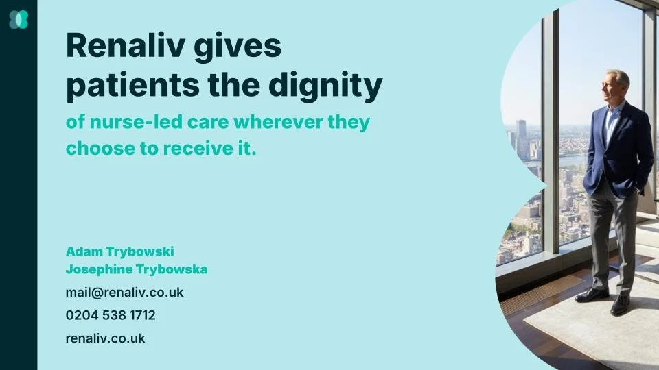
Photography added a human dimension, bringing the narrative back to patients, care professionals and the experience of receiving treatment.
The visual system
One cohesive language across
the presentation
Colour and typography
The combination of aqua, teal and deep navy established contrast and hierarchy throughout the deck. Bold typography brought emphasis to key messages, helping the audience navigate the content and identify the central idea on each slide.
Information design
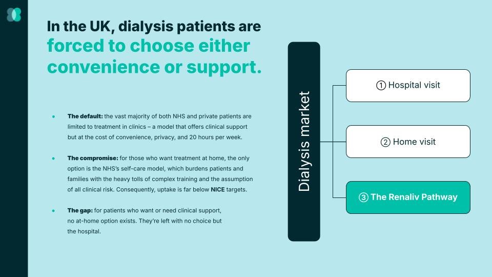
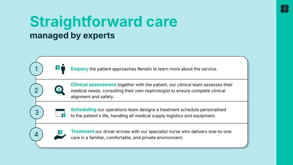
Complex information was organised into structured layouts, from comparisons of existing care models to diagrams explaining the Renaliv patient pathway. These visual structures helped turn detailed information into a more accessible narrative.
Imagery and graphic elements
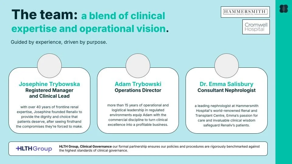
Photography, simple icons and recurring graphic motifs connected the slides visually. The consistent treatment of imagery and content helped the presentation feel like one cohesive story rather than a collection of separate pages.








Bringing the story to life
From patient needs to business opportunity
The presentation moves through four key themes.
01. The problem
Establishing the challenges of existing haemodialysis models and the unmet needs of patients seeking greater convenience, privacy and support.
02. The proposition
Introducing Renaliv’s approach to nurse-led care, with treatment delivered in a setting that better accommodates the patient's life.
03. The service experience
Explaining the patient journey, from initial enquiry and clinical assessment through scheduling and treatment.
04. The business opportunity
Presenting the target market, competitive positioning and service models in a structured, accessible format.
Together, these sections connect the human rationale for the service with the operational and commercial thinking behind the concept.
The outcome
A clearer story for a new approach to care
The result was a cohesive pitch deck that brought Renaliv’s proposition, service model and market opportunity together through a consistent visual language.
By combining clear messaging, structured information design and considered art direction, the presentation makes a complex healthcare concept easier to follow while keeping its central promise in focus: giving patients more choice without losing the reassurance of expert care.
The takeaway: Strong design can make complex ideas easier to understand and believe in. For Renaliv, the goal was to connect a human centred healthcare proposition with a clear, confident business narrative. Creating a presentation that communicates both the need for change and the vision for what could come next.
Portfolio