Perfect Peaches.
Challenging perfection through playful beauty storytelling
Creative direction · Campaign concept · Art direction · Digital design
A beauty launch campaign exploring how visual storytelling can introduce a product with personality, confidence and a distinctive point of view.
For Health Xchange Beauty, I developed a series of launch concepts spanning social media, email, web banners, blog content and responsive landing pages. The work explored different visual directions while creating a connected campaign experience across digital touchpoints.
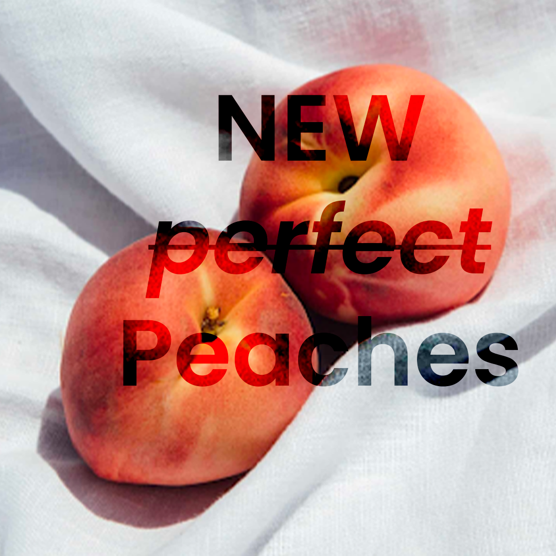
At the heart of the concept was a simple creative device: the peach. Used as an abstract stand-in for the product, it provided a playful visual starting point for exploring beauty, expectation and the idea of perfection.
The creative challenge
Finding a fresh perspective on beauty
Beauty marketing often relies on idealised imagery and the pursuit of perfection. The opportunity was to approach the launch with a more playful visual idea, using an unexpected object to capture attention and create curiosity around the product.
The peach became the central creative device. Recognisable enough to communicate the idea of beauty, yet abstract enough to leave room for interpretation.
Typography added another layer to the concept. Crossing out selected words created emphasis while playfully questioning the idea of a “perfect” peach, introducing a visual tension between expectation and reality.
Exploring two creative directions
One launch, two expressions
Rather than settling on a single aesthetic from the outset, I developed two distinct launch concepts to explore different expressions of the brand.
Direction one — Understated and considered
A more neutral visual approach placed the emphasis on simplicity, creating space for the concept and product imagery to speak for themselves. The restrained palette offered a clean, contemporary interpretation of beauty.
Direction two — Colourful and expressive
A more vibrant direction introduced additional colour and energy, giving the campaign a stronger sense of playfulness and visual personality.
Both concepts explored the same central idea through different creative treatments, demonstrating how colour and art direction could shift the tone of a campaign while retaining its underlying concept.
Bringing the campaign to life
From teaser to launch
The creative extended across the launch journey, with each asset playing a role in building awareness, introducing the product and communicating its benefits.
01. Teaser campaign
Social content, email and web banners introduced the visual concept and created anticipation ahead of the launch.
02. Launch reveal
Social assets and web banners developed the initial idea into a more direct product introduction, bringing the campaign into focus.
03. Landing page and email
Desktop and mobile landing pages, alongside launch email creative, carried the visual language into more detailed digital experiences.
04. Educational social content
Two social benefits carousels provided a format for communicating product benefits through a structured, visually engaging sequence.
05. Supporting editorial content
A website blog extended the campaign beyond promotional assets, creating another touchpoint for the launch narrative.

Launch reveal assets for social

Launch reveal assets web banner

Launch web banner

Launch email

Teaser for socials

Teaser web banner

Launch assets for social

Teaser email

Blog for website

Landing page for desktop

landing page for mobile

Social benefits carousel 1

Social benefits carousel 2
A connected digital experience
Consistency across every touchpoint
Across social media, email, web banners and landing pages, the campaign maintained a recognisable visual language while adapting to the needs of each format.
The peach imagery, considered typography and contrasting creative directions gave the work a consistent foundation. The challenge was to preserve the character of the concept across different dimensions, placements and stages of the launch.
From the first teaser through to product-focused content, each asset formed part of a broader campaign rather than operating as an isolated execution.
The outcome
A flexible creative concept with a distinctive point of view
The project resulted in a collection of launch assets spanning social, email, web and editorial content, supported by two alternative creative directions.
By combining an abstract visual motif with playful typography, the campaign explored a more characterful approach to beauty communication. The two directions also demonstrated how the same central concept could support different visual expressions while maintaining a coherent campaign identity.
The takeaway: Strong campaign design starts with an idea that can travel. By developing a distinctive visual concept and translating it across multiple touchpoints, a simple creative device can become the foundation for a connected launch experience.
Portfolio