Grabyo.
Building a cohesive brand for the future of live video
Brand strategy · Creative direction · Visual identity · Digital design
Grabyo is a video platform enabling broadcasters, sports organisations and media companies to create and distribute video content. As the business evolved, its brand needed to evolve with it.
I developed a new creative direction and visual identity that brought Grabyo’s products, marketing and business touchpoints together under one cohesive brand. Creating a more distinctive, flexible and recognisable visual language.
The challenge
From disconnected assets
to a unified brand
The existing identity was restrictive and dated, built around two brand colours and a single typeface, with no defined image style or consistent tone of voice.
As the business grew, individual assets were being designed in isolation. The product, website, marketing materials and sales communications lacked a shared visual direction, making it difficult to express Grabyo as one connected business.
The challenge was to create an identity that could support different products and audiences while maintaining a clear and consistent brand.





The creative direction
One brand. Multiple products.
A shared vision.
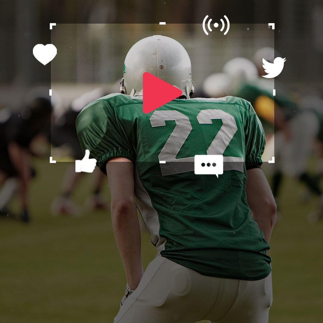
I developed a visual identity designed to bring the different parts of Grabyo together, giving the brand greater consistency while allowing each product to retain its own character.
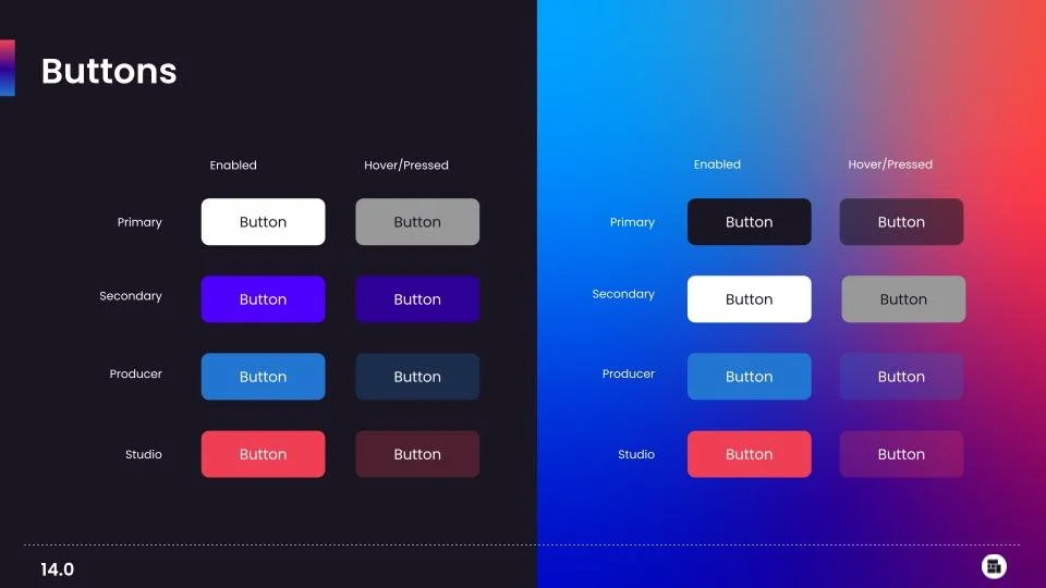
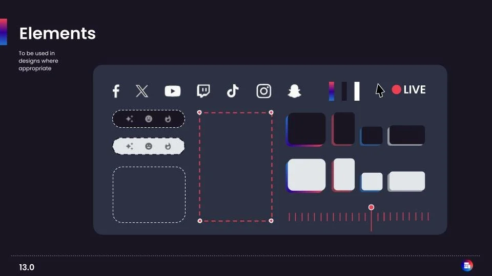
The direction centred on three principles: a flexible visual system, a distinctive use of colour and a consistent approach to typography and imagery.
Every element needed to work as part of a wider system — from the product experience and website to marketing campaigns, sales presentations and supporting communications.
The identity system
A visual language built around video
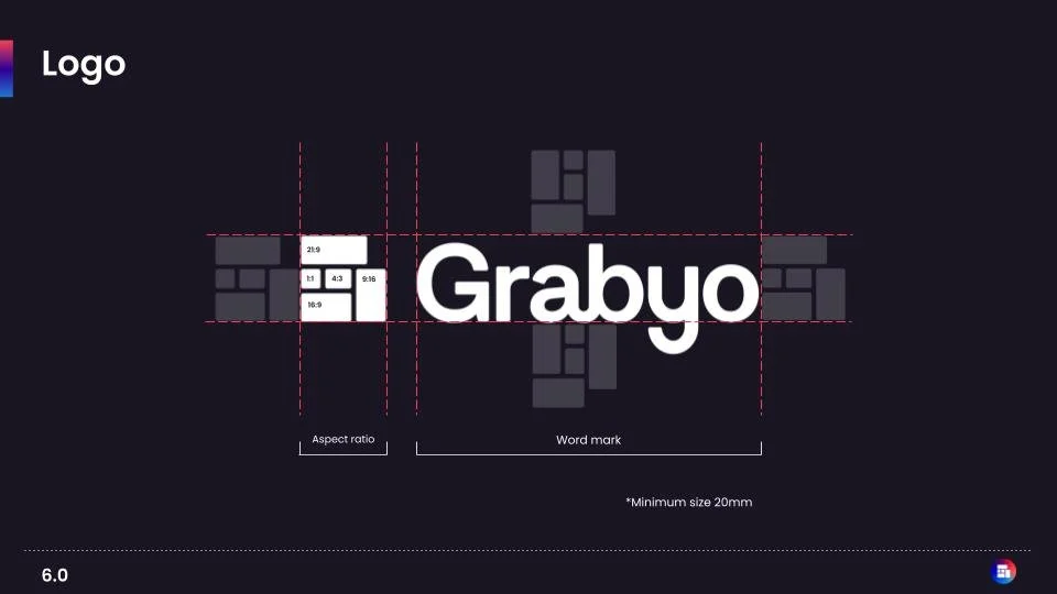
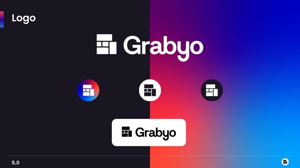
A logo inspired by video
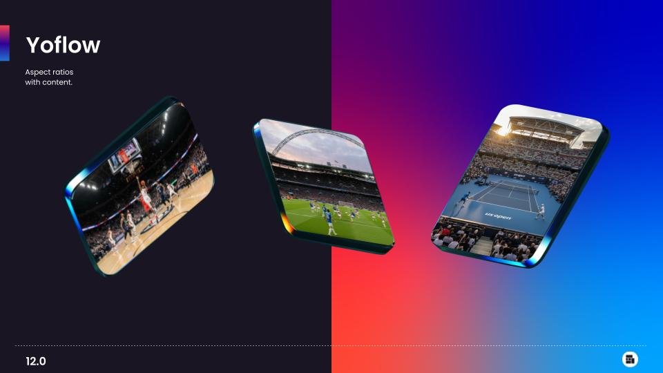
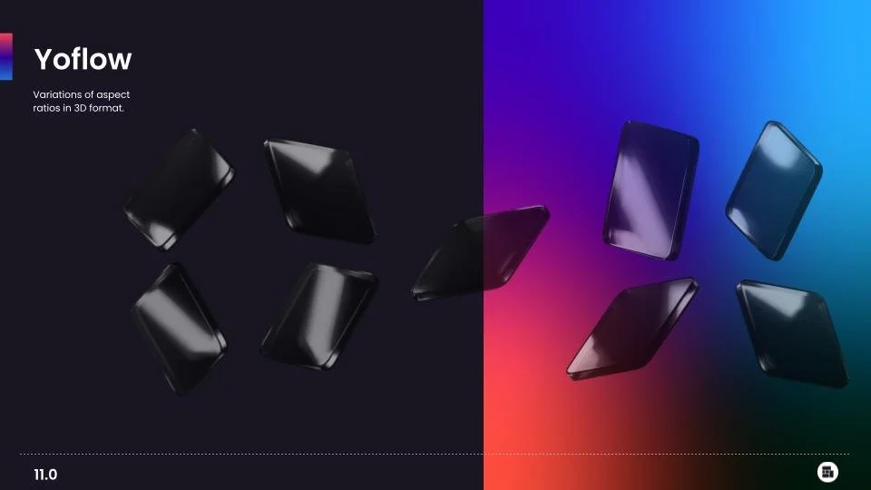
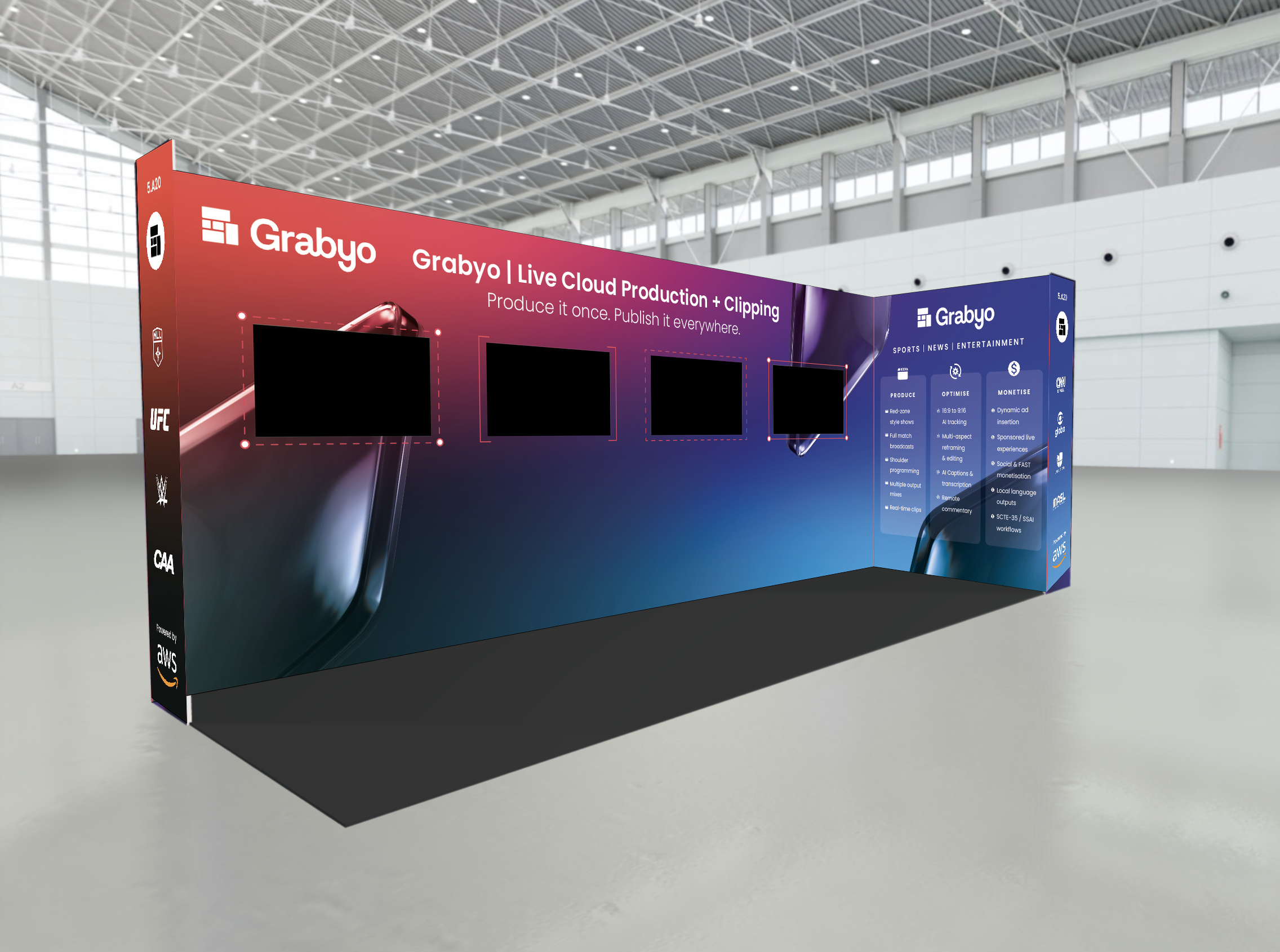
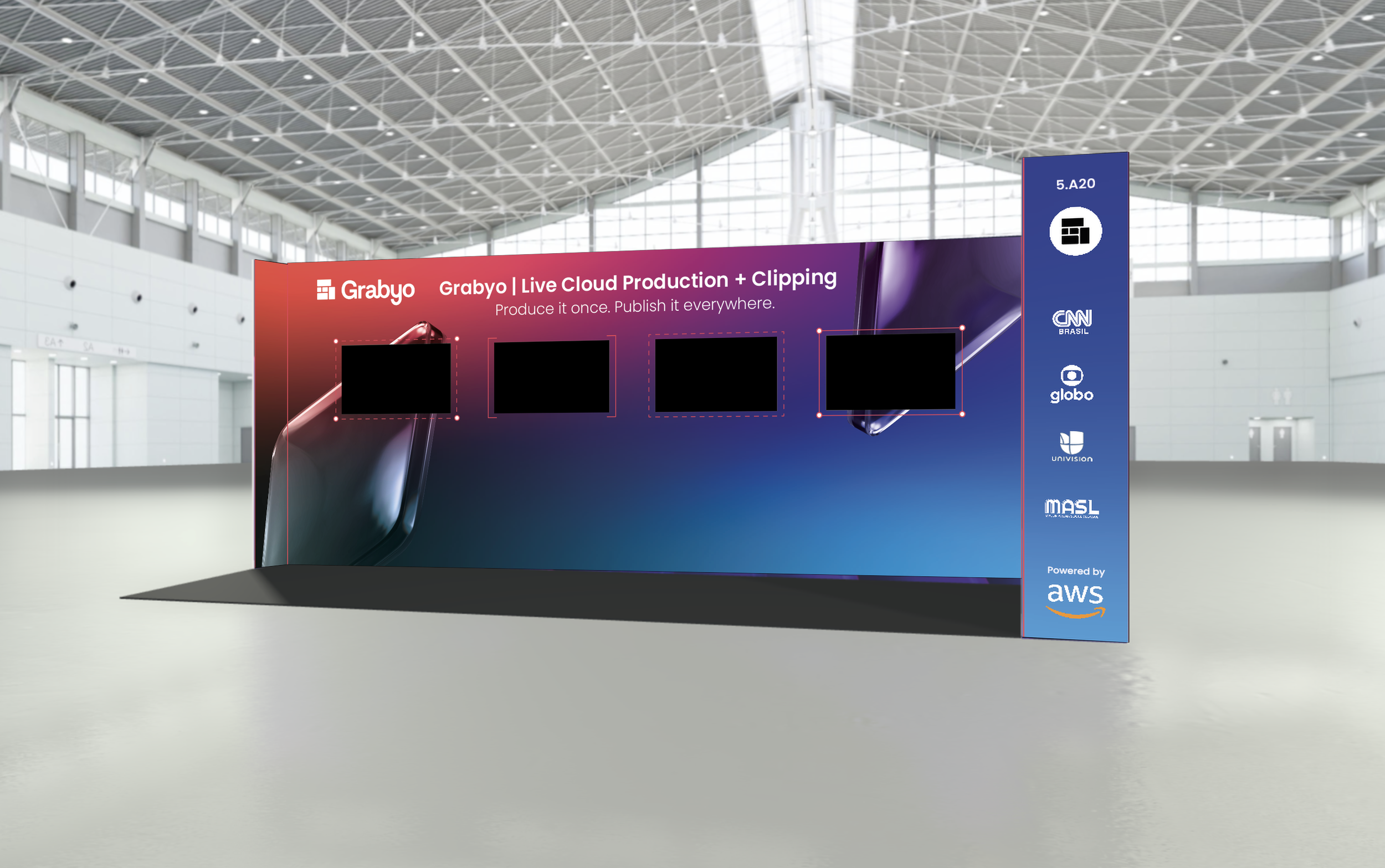
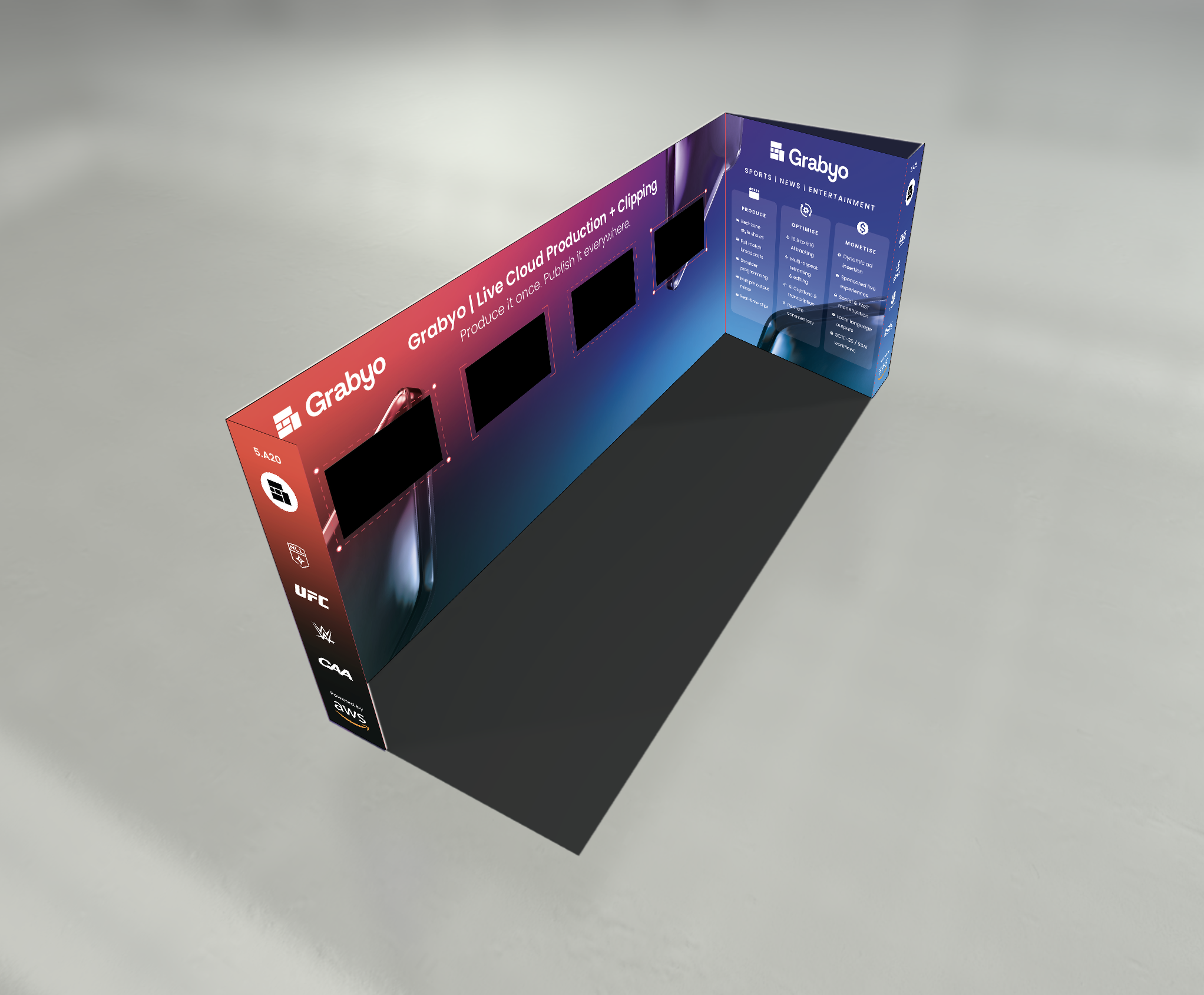
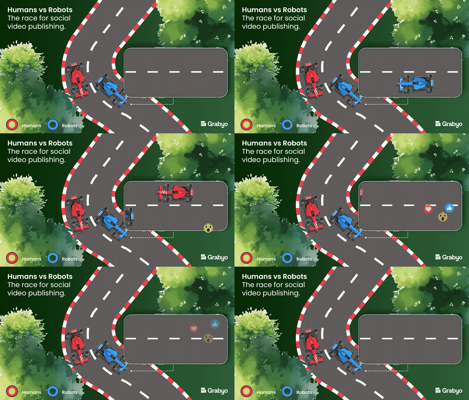
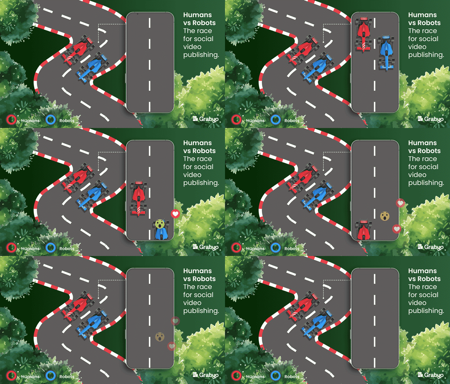
The logo draws on the aspect ratios used when exporting video, connecting the identity directly to a fundamental part of Grabyo’s offering. These aspect-ratio cards became a supporting graphic device, used selectively across sales decks, landing pages and exhibition stands to showcase content and reinforce the brand.
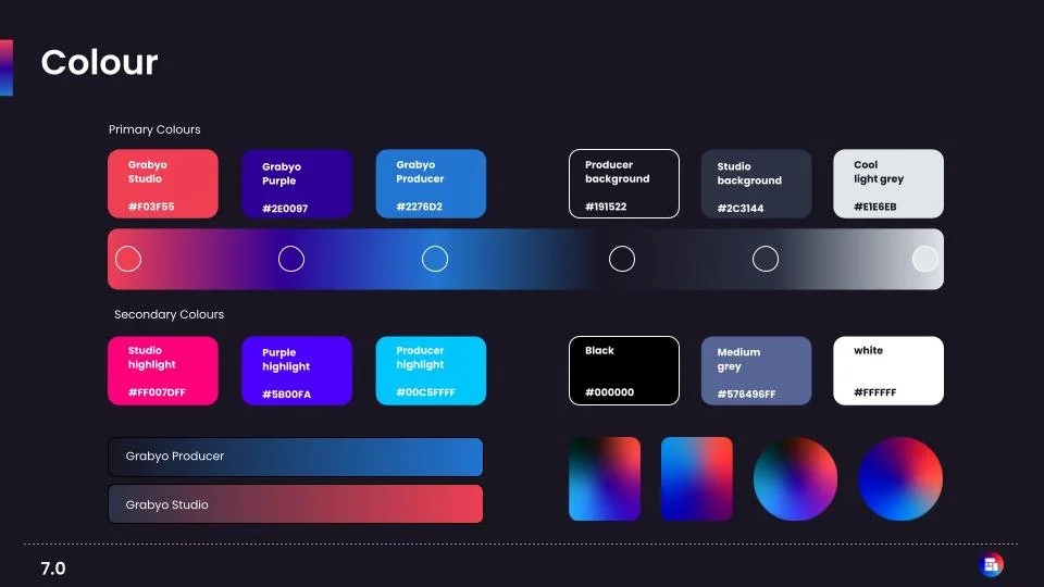
Colour with purpose
The colour palette connects the blue associated with the Producer platform and the red associated with the Clipping platform. These colours combine into purple when representing Grabyo as a whole.
This creates a visual distinction between the products while preserving a unified master brand. Making the system more intuitive, flexible and expressive.
Typography and visual consistency
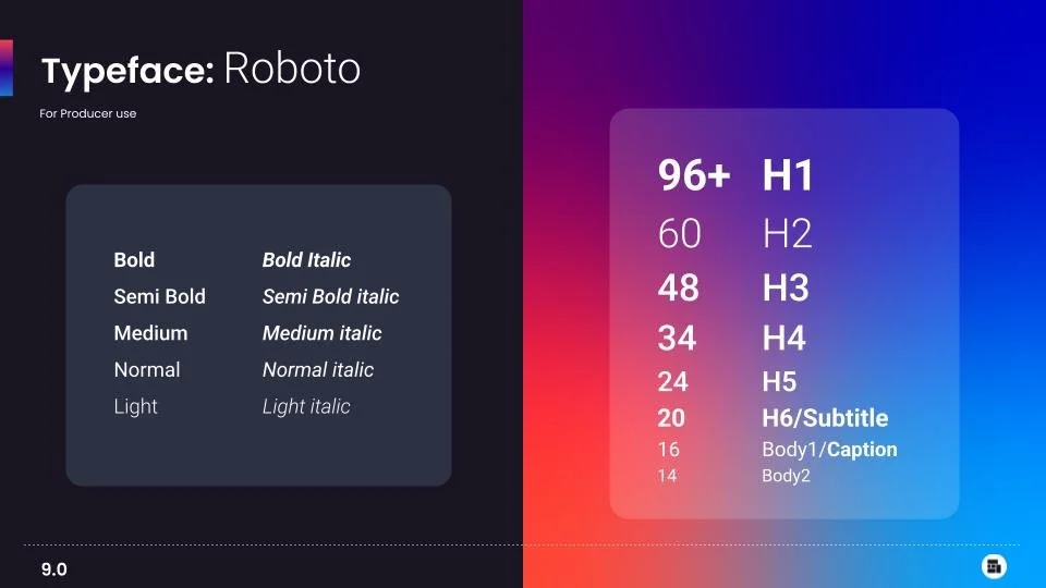
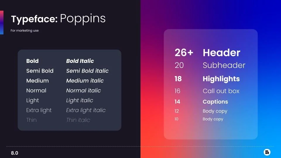
I introduced a new typeface for marketing and web, establishing a more considered and recognisable typographic style. Combined with a gradient that represents the relationship between the different parts of the business, the identity creates a stronger sense of connection across every touchpoint.
Bringing the brand to life
A consistent experience across every touchpoint
The new creative direction extended beyond the core identity into the everyday experience of the brand.
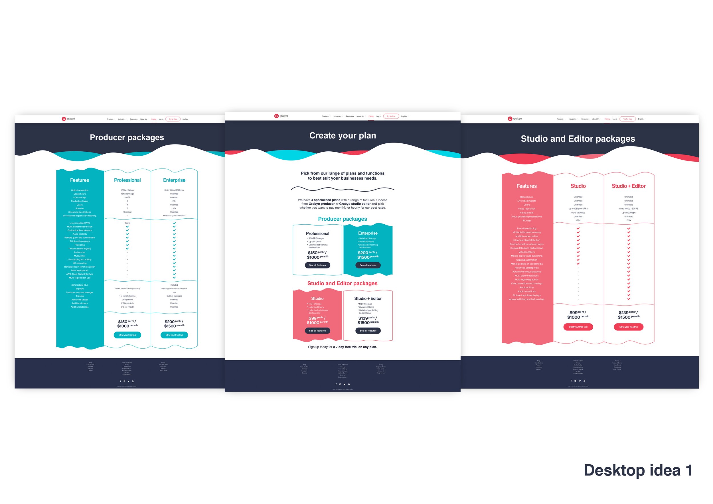
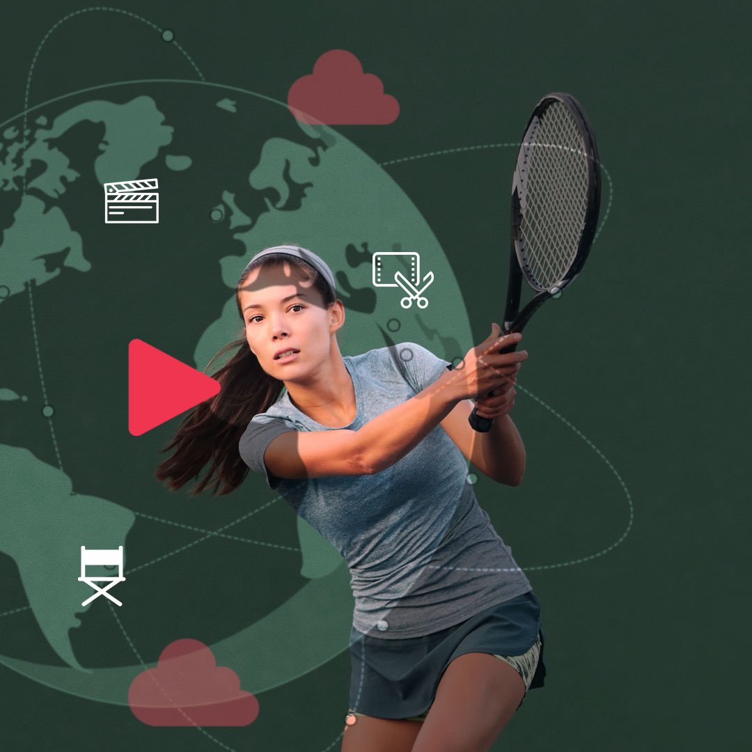
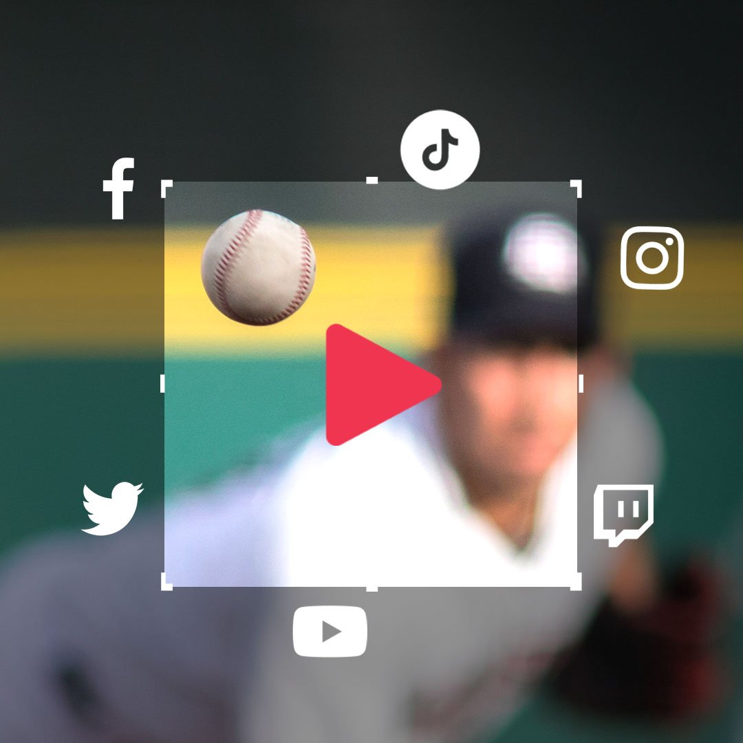
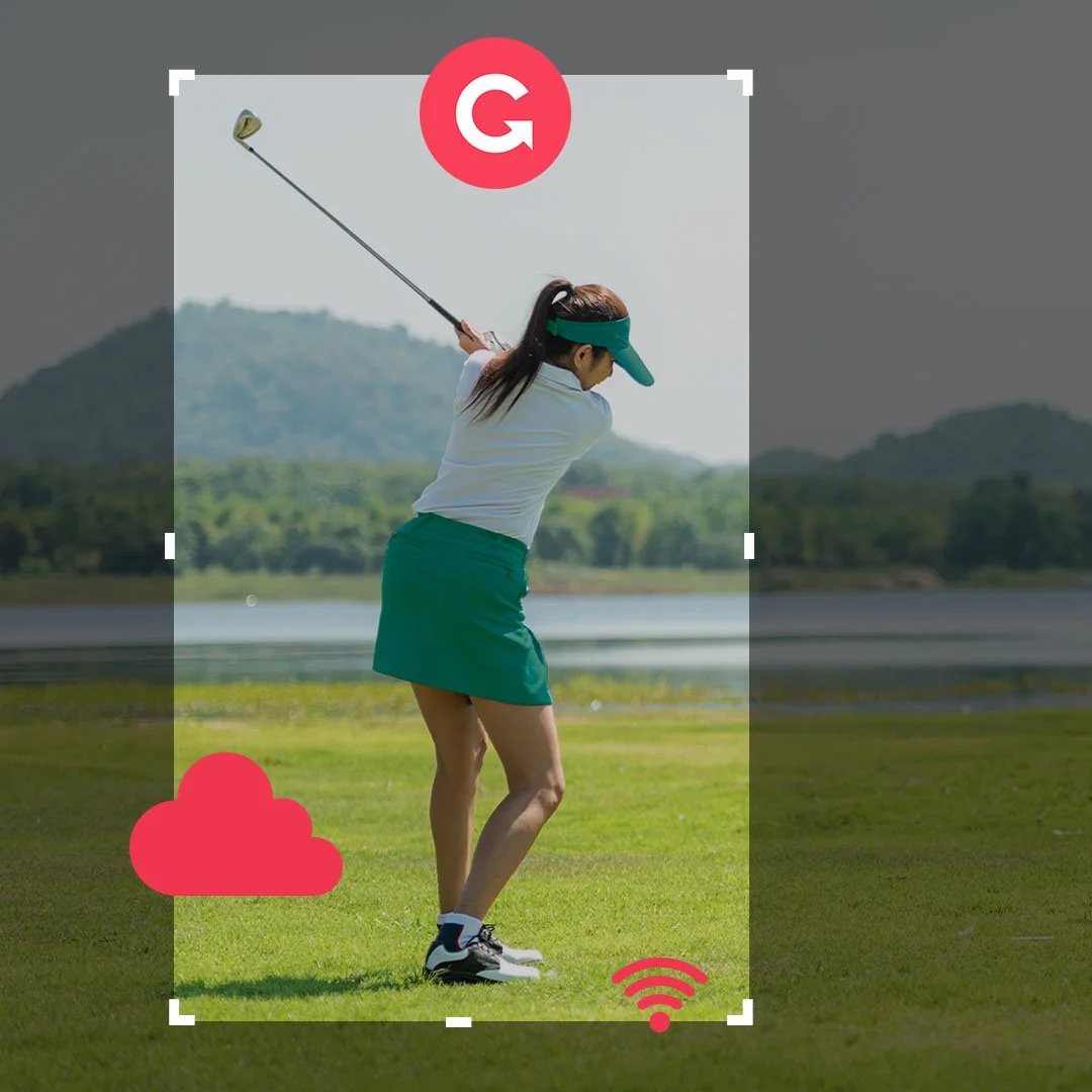
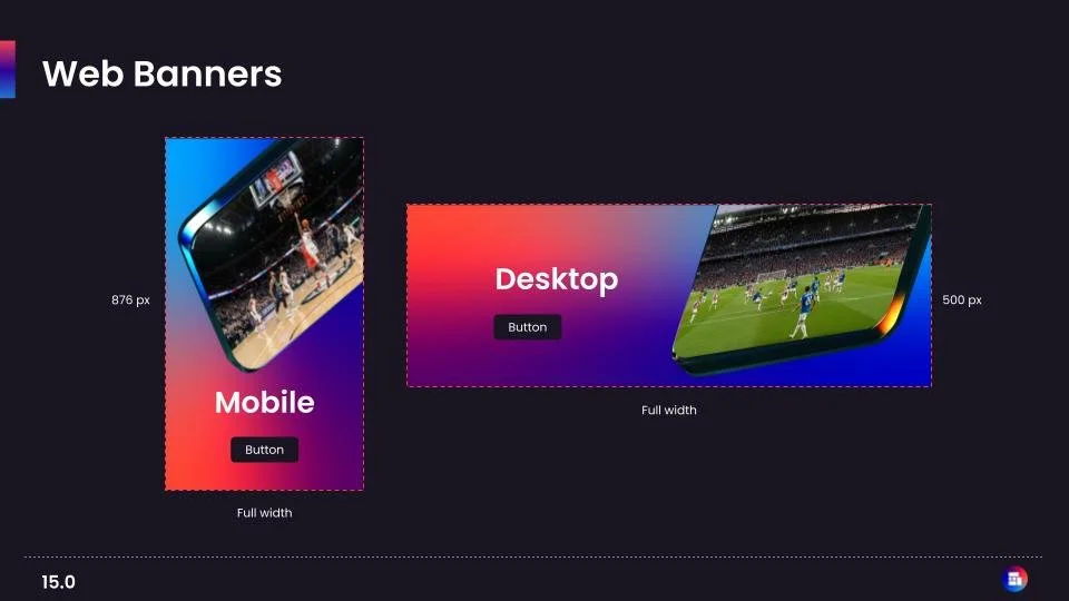
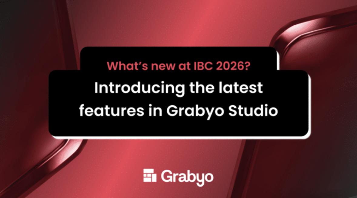
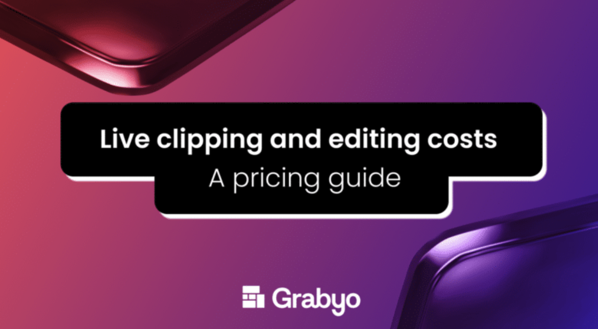
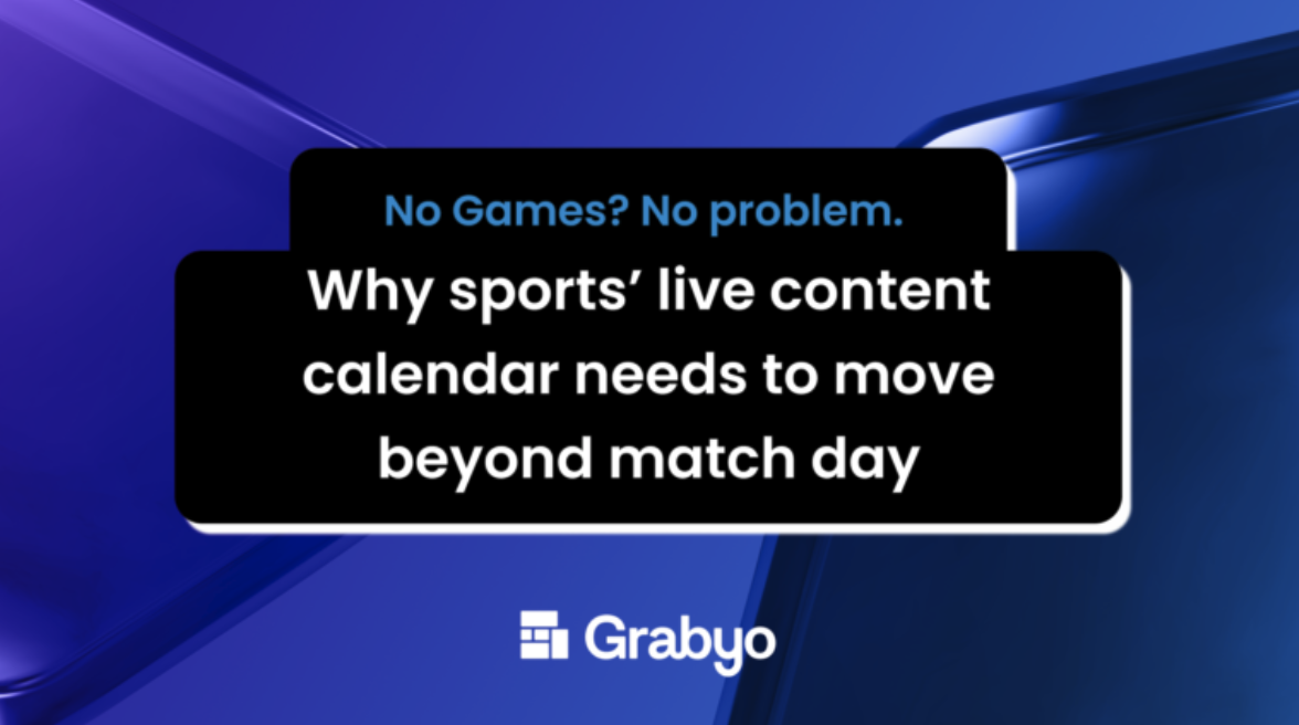
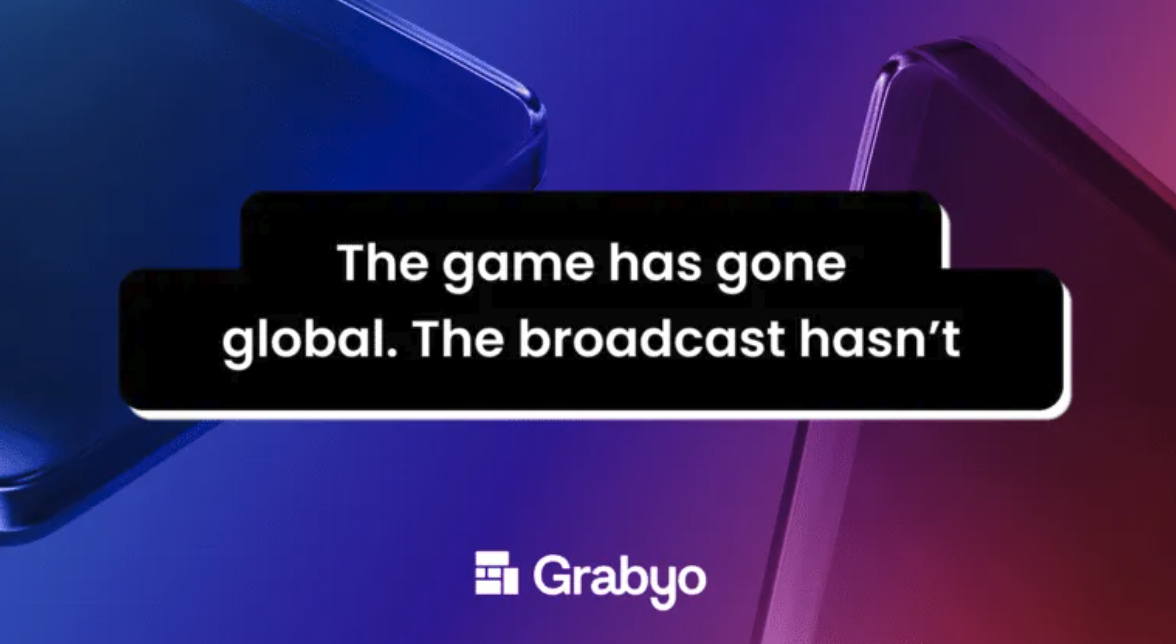
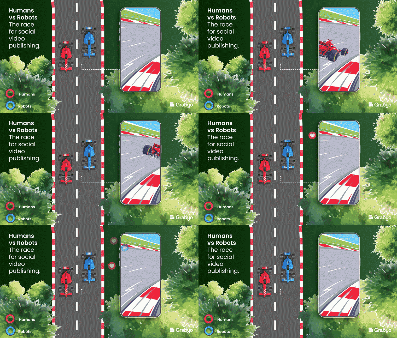
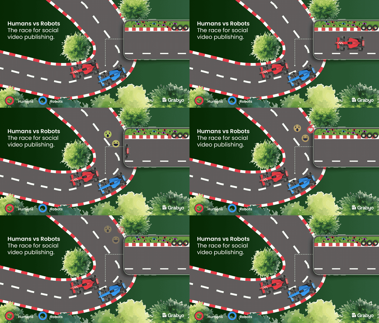
I applied the system across website and pricing pages, social content, sports reports, video trends research, marketing campaigns and sales materials.
Each application was designed to feel part of the same brand, creating greater consistency across channels while allowing the content and context to shape how the identity was used.
The result was a more flexible creative system that could adapt to different formats, audiences and communications without losing its identity.




The Product
Desktop . Mobile . Prototype
Reimagining the live production experience
Product design · UX/UI · Design systems · Desktop & mobile experiences
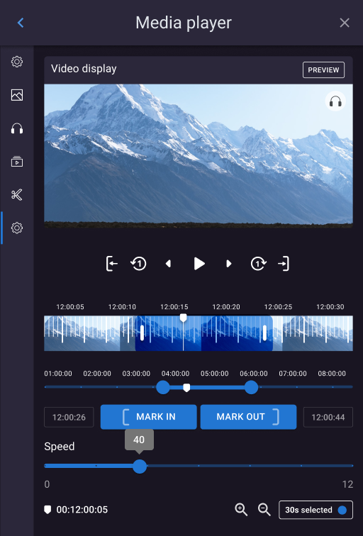
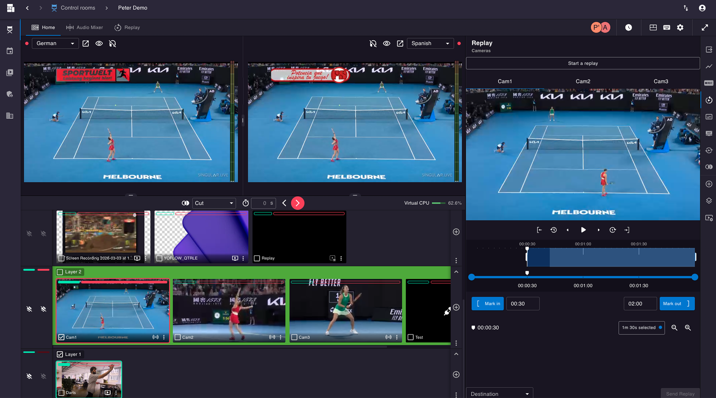
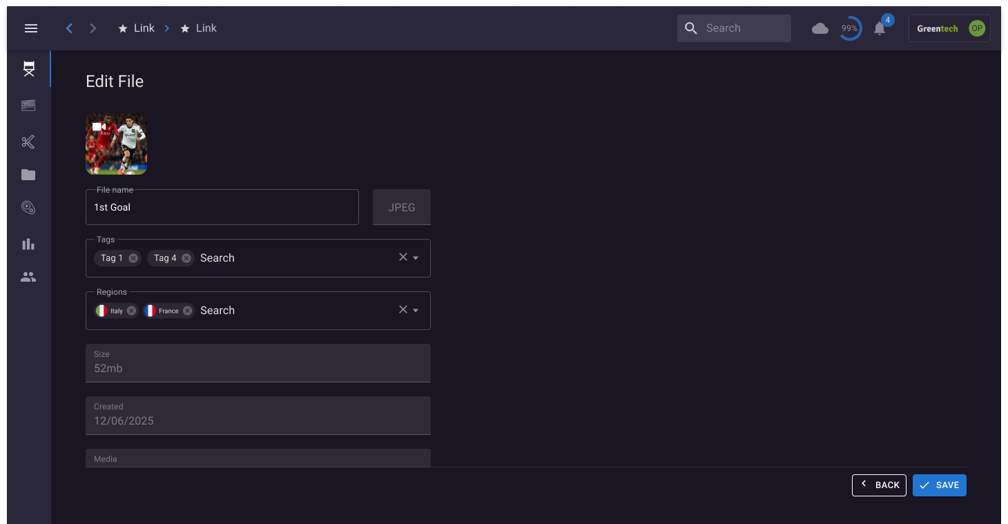
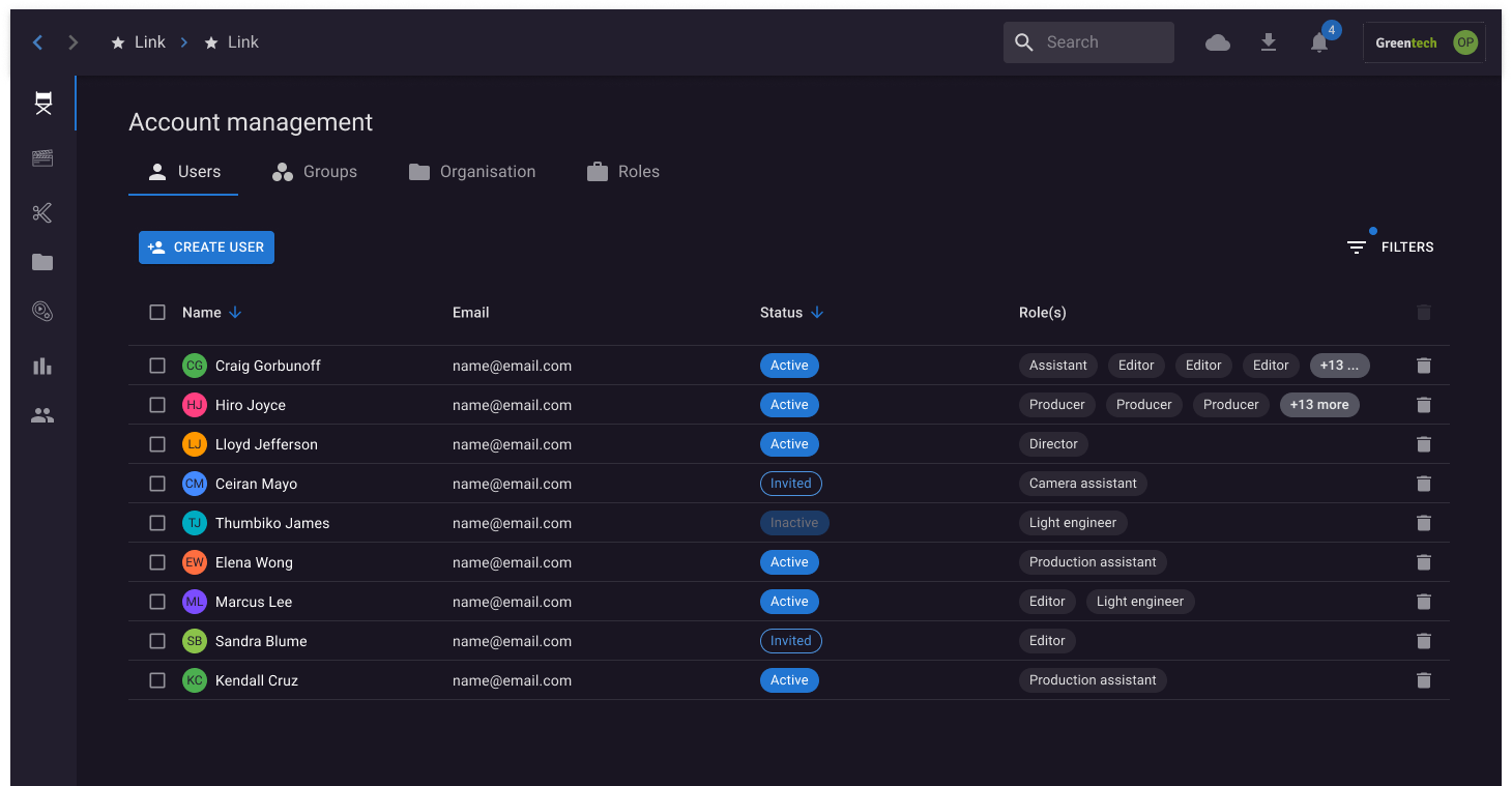
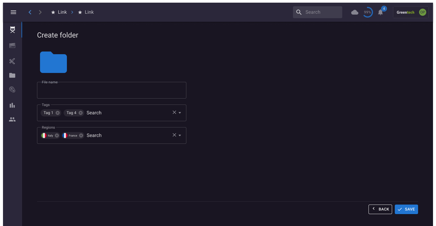
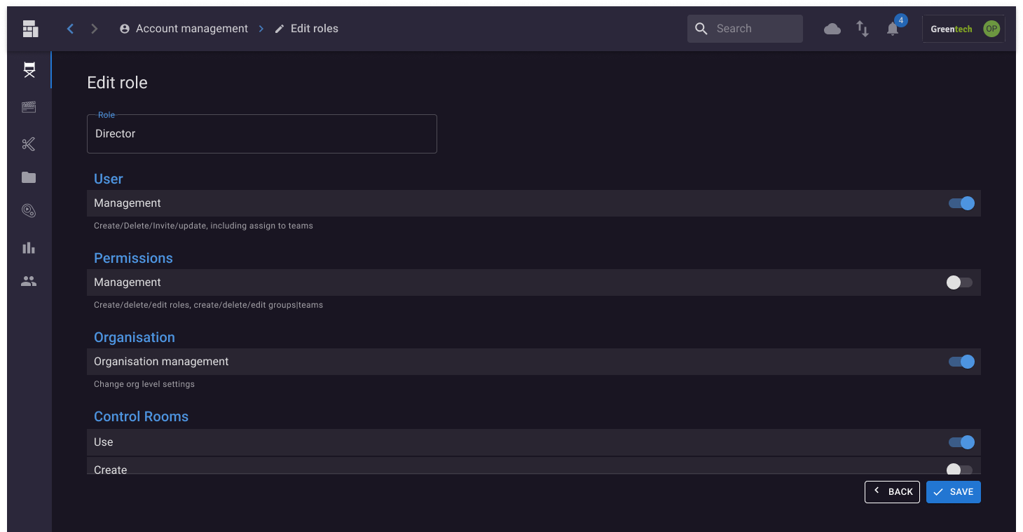
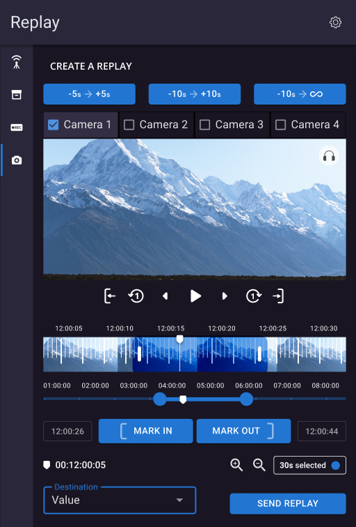
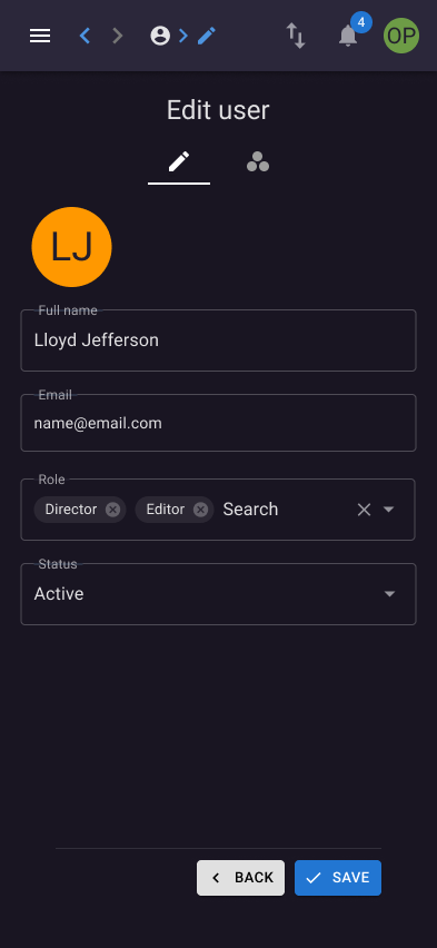
A two-year project to reimagine Grabyo’s live production platform, transforming a legacy experience into a more intuitive, cohesive and accessible interface for professional video production workflows.
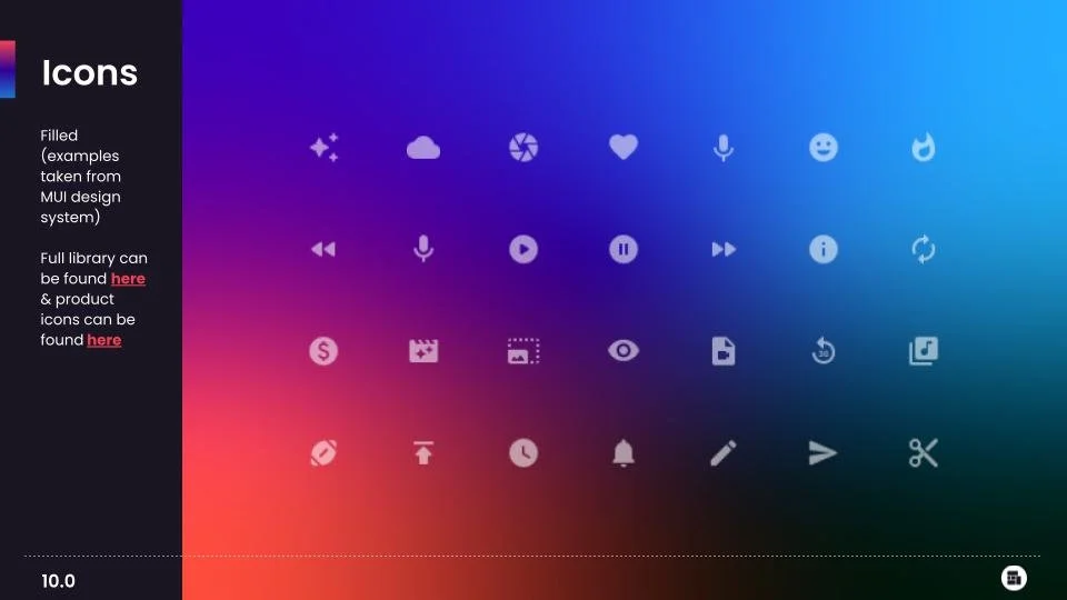
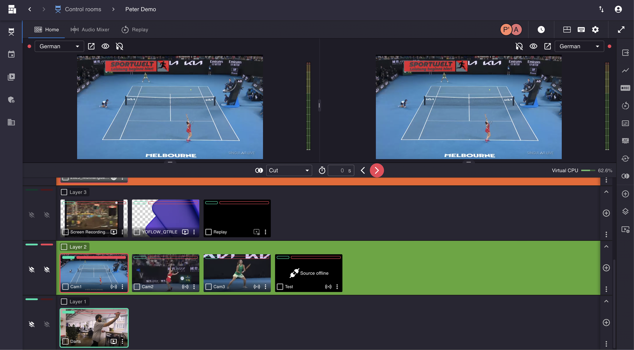
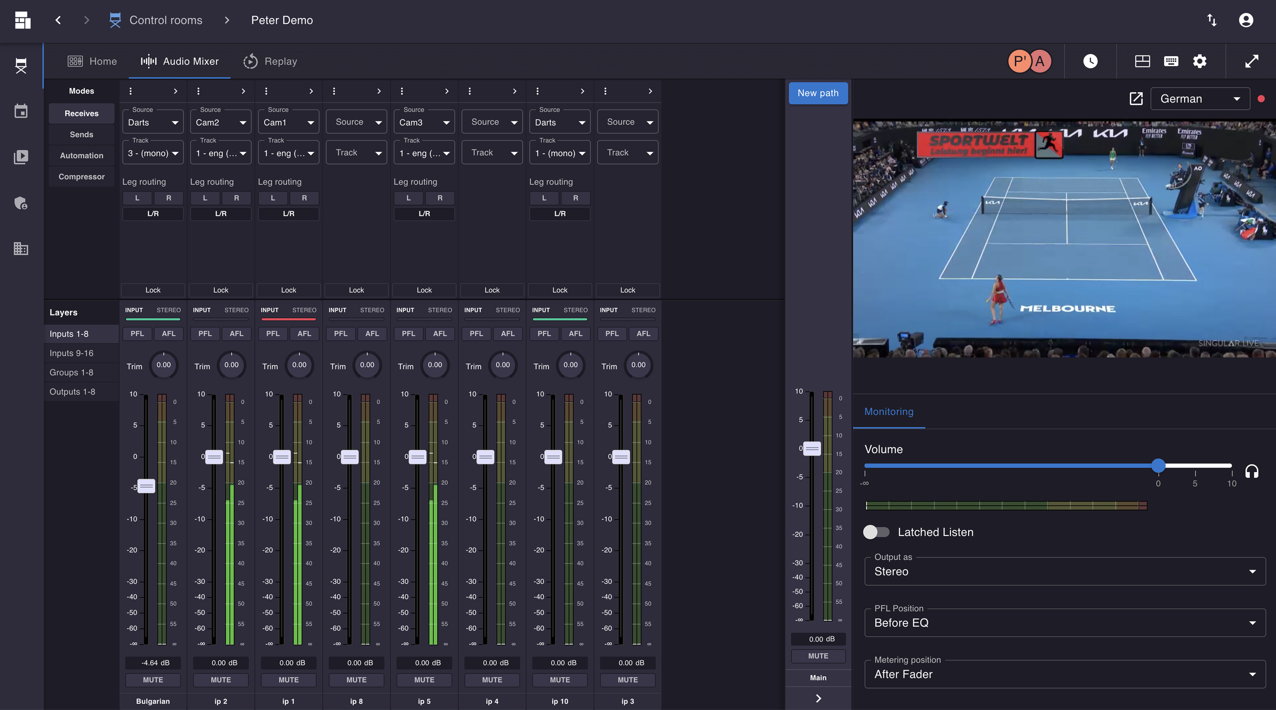
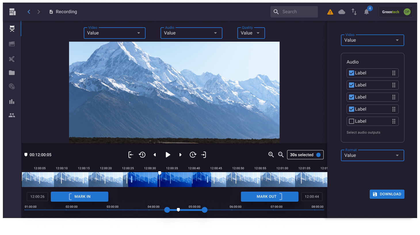
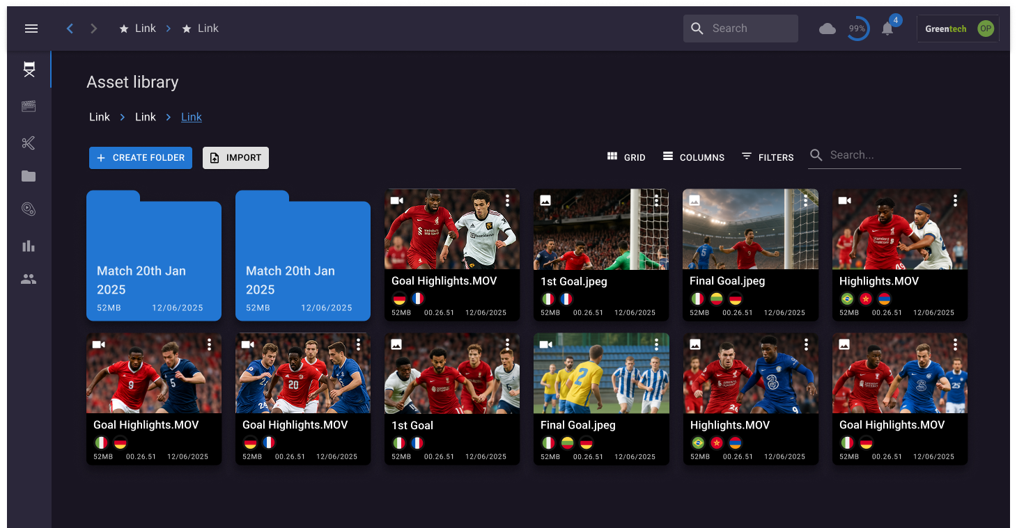
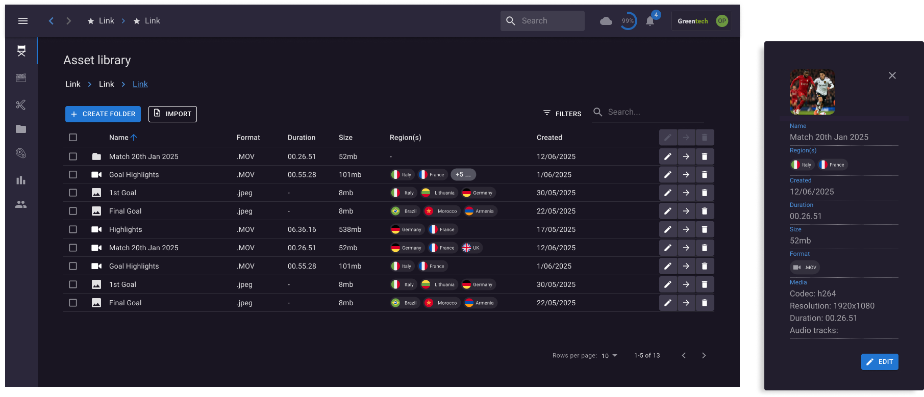
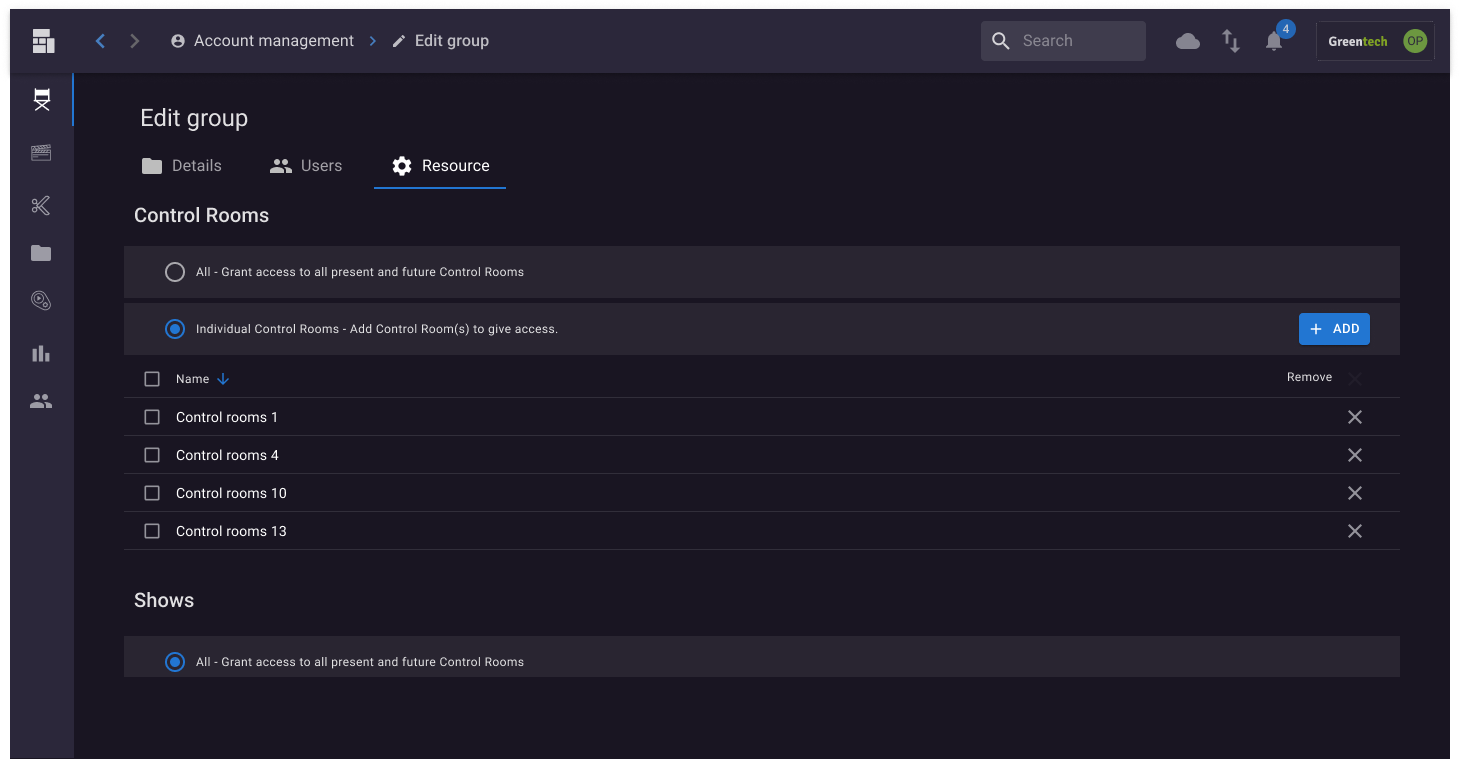
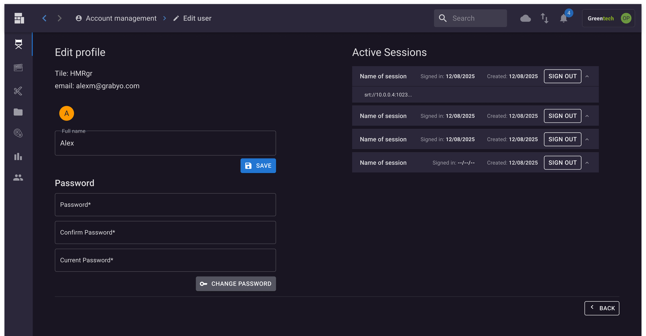
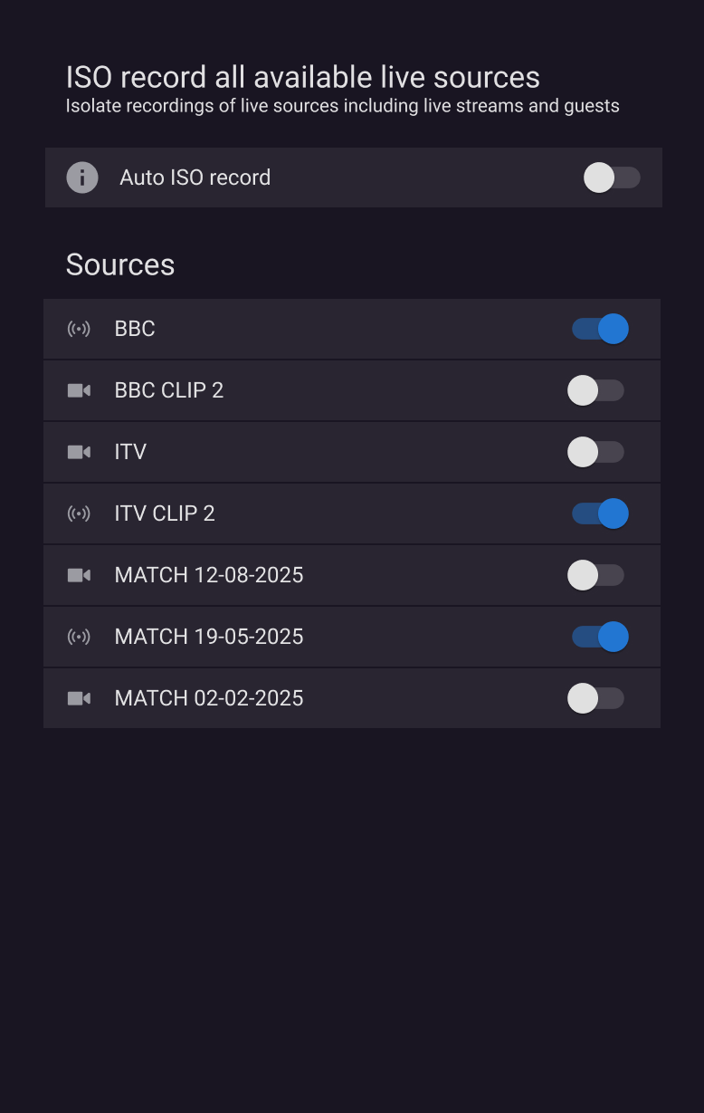
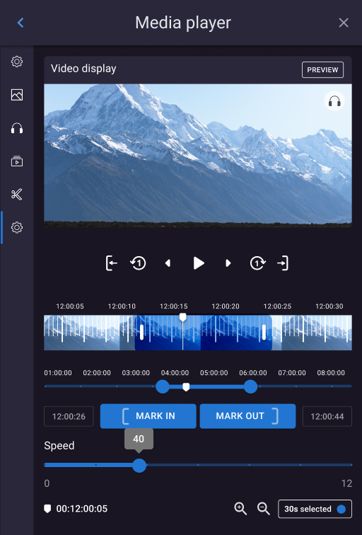
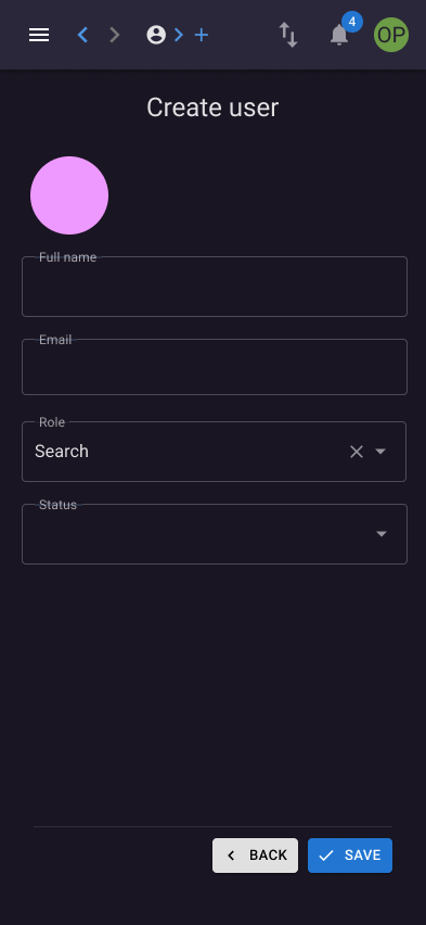
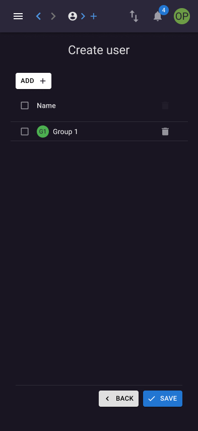
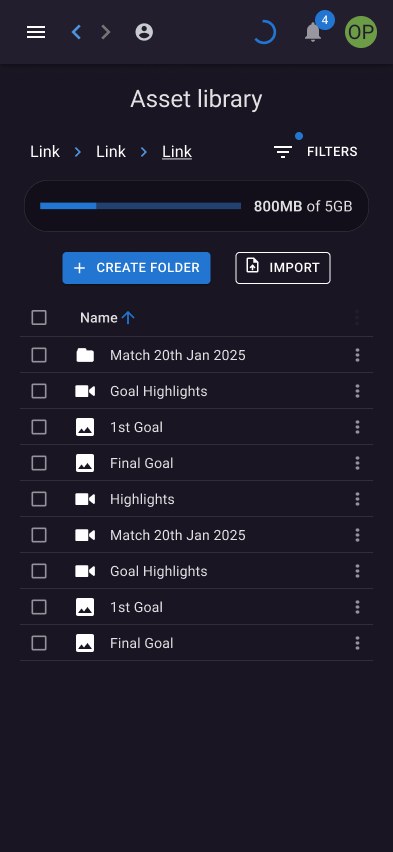
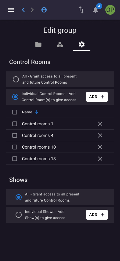
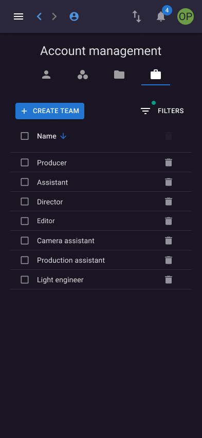
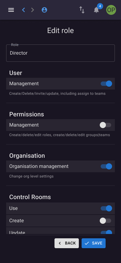
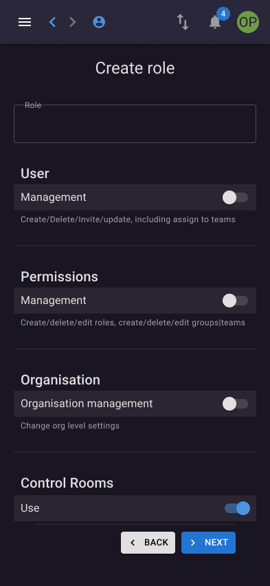
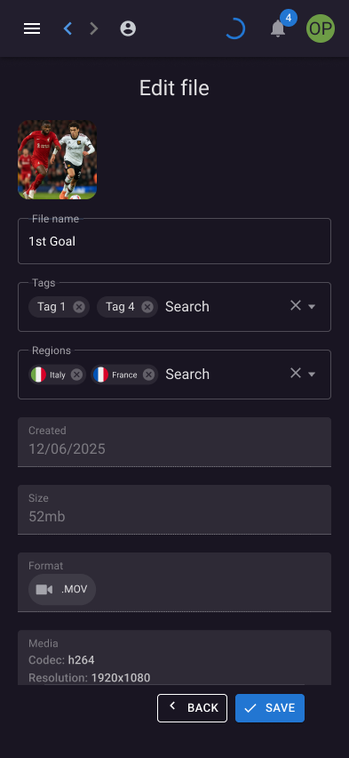
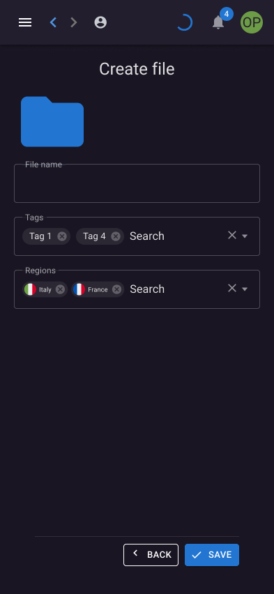
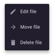
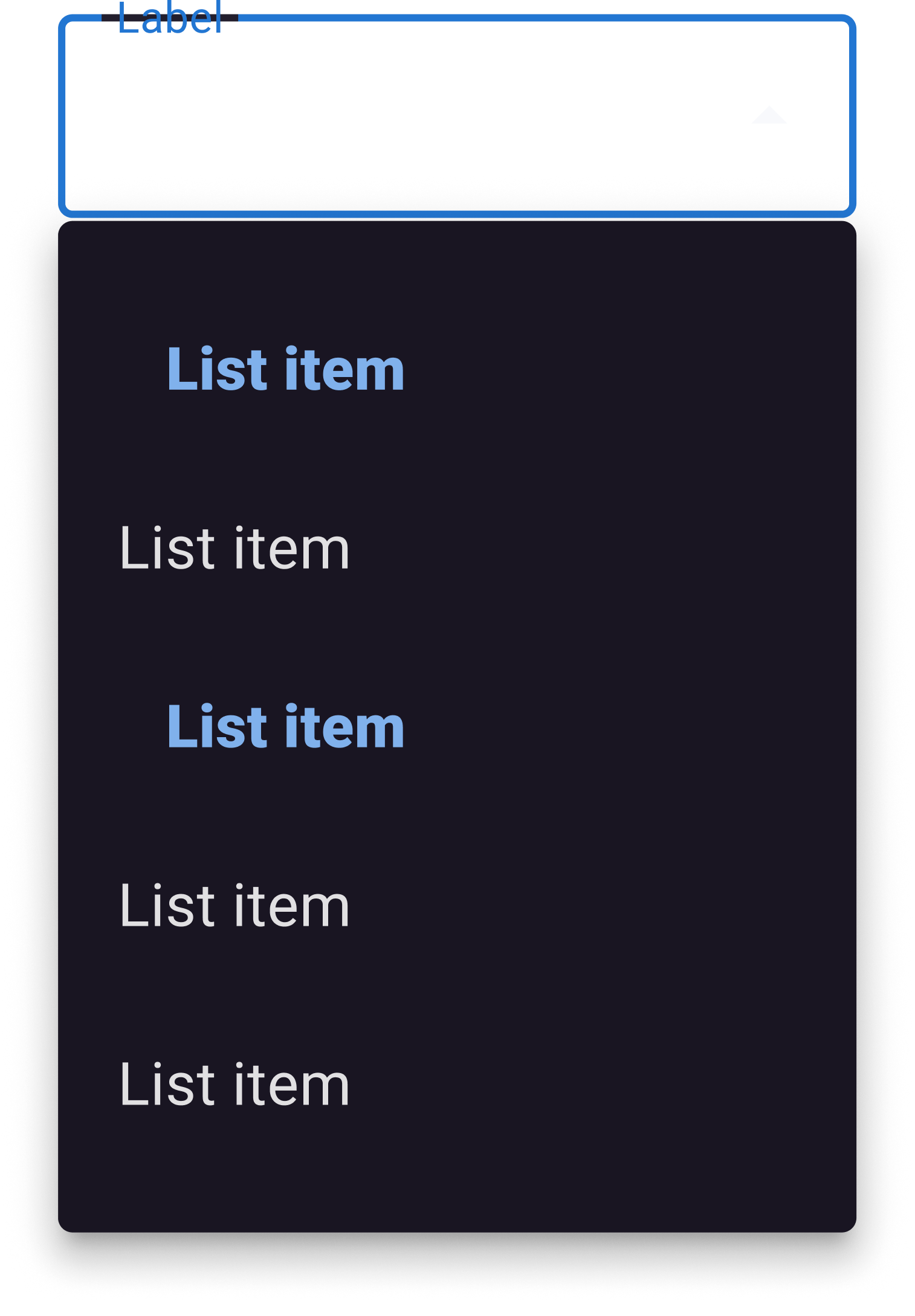
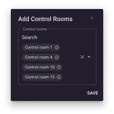
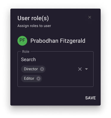
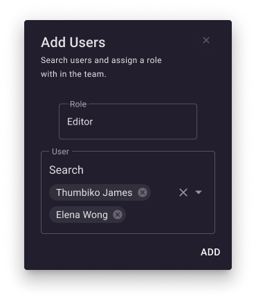
Using the MUI design system as a foundation, I redesigned key areas of the platform, bringing clarity and consistency to a complex product used to manage live production, audio, replays, recordings, media assets and user permissions.
The focus was on making sophisticated tools easier to navigate, creating a consistent experience across workflows and establishing a stronger design foundation for the platform.
Desktop UI
Mobile UI
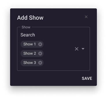
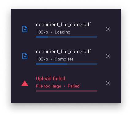
The prototype
The outcome
A stronger foundation for
a growing brand
The project established a more cohesive visual direction for Grabyo, connecting its products and business communications through a shared identity.
By bringing colour, typography, graphic devices and creative direction into one system, the brand could communicate with greater consistency across product, marketing, sales and digital experiences.
More than a visual refresh, the work created a framework for how Grabyo could express itself as one business while giving its individual products room to stand apart.
The takeaway: Great brand design is not just about creating a distinctive identity. It is about building a system that connects people, products and experiences. Giving a business the tools to communicate consistently as it grows.
Portfolio